
The art of selecting wall paint color combinations transcends mere aesthetics; it’s an intricate dance of psychology, design, and personal expression.
These combinations wield the power to shape emotions, transform spaces, and reflect the unique personality of individuals.
Understanding the principles of Wall Paints Color Combination, the impact of textures and finishes, and the significance of personalization within these combinations form the foundation of creating captivating, harmonious environments.
It’s a journey that goes beyond paint on walls, delving into the language of hues and their profound influence on the spaces we inhabit.
Psychology Of Color Selection:
The selection of colors for your walls is more than a mere aesthetic choice; it’s a profound exploration into the human psyche. Colors possess an innate ability to deeply affect our emotions, behavior, and overall mood.
Understanding this impact can empower you to curate spaces that resonate harmoniously with your desired ambiance.
Triggers Of Colour Combinations:
Each color is a conduit of emotions. Exploring combinations reveals an intriguing world where hues interact to evoke specific feelings and responses.
For instance, the embrace of warm tones such as passionate reds or comforting oranges can cocoon a room in a sense of coziness, invoking feelings of intimacy and warmth.
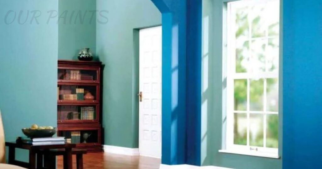
Conversely, cooler tones like tranquil blues or serene greens often instigate a sense of calmness, clarity, and heightened focus, fostering productivity in workspaces.
The Intricate Dance Of Color And Mood:
Colors have a dynamic relationship with our psychological landscape. They possess the power to uplift spirits, soothe nerves, or even stimulate creativity.
The careful interplay of these shades can transform the ambiance of a space, creating an environment that resonates with its occupants on a deeply emotional level.
Beyond Perception: Impact On Behavior:
The influence of colors extends beyond mere perception. Studies reveal that certain colors can impact heart rate, blood pressure, and even appetite. Vibrant yellows can induce energy and enthusiasm, while softer pastels might encourage relaxation and reflection.
By understanding these subtleties, you gain the ability to craft environments that complement and enhance various activities and moods.
Customizing Spaces With Emotional Intent:
Understanding color psychology allows for the intentional customization of spaces. Whether it’s a vibrant living room fostering lively conversations or a serene bedroom promoting restful sleep, choosing colors strategically can align spaces with their intended purposes, catering to the emotional needs of its inhabitants.
Expression Through Colours:
Colors serve as a canvas for self-expression. They enable individuals to convey their personalities, preferences, and emotions within their living spaces.
By harnessing this power, one can create atmospheres that reflect their unique identity and resonate deeply with their sensibilities.
Exploring the psychological dimensions of color selection provides a deeper insight into the intricate language of hues and their profound impact on our lives.
Such knowledge empowers individuals to craft spaces that not only please the eye but also nurture the soul and emotions within.
Harmonious Colour Theory:
Color theory stands as the backbone of artistry, design, and aesthetics. It’s a mosaic of principles complementary, analogous, triadic, and more each offering a unique perspective on how colors interact and complement one another.
Exploring these theories unveils the magic behind creating visually captivating and harmonious wall color combinations.
The Symphony Of Color Relationships:
At its core, color theory unravels the intricate dance of hues. Complementary colors, situated opposite each other on the color wheel, create a dynamic contrast that enhances each other’s intensity.
Analogous colors, adjacent to the wheel, establish a gentle harmony, perfect for creating a soothing and coherent atmosphere. Triadic combinations, formed by selecting three equidistant colors, evoke vibrancy and balance, adding depth and vitality to walls.
Guiding Principles For Harmonious Walls:
Understanding these color theories serves as a guiding compass in the realm of interior design. They equip enthusiasts with the knowledge to select colors that not only coexist but synergize seamlessly, transforming walls into captivating canvases that evoke specific emotions and energies within a space.
Balancing Act Of Visual Harmony:
True artistry lies in achieving balance. Color theory empowers individuals to strike the perfect balance, avoiding clashes and disharmony.
It’s about orchestrating a symphony of colors where each shade plays a pivotal role, contributing to an aesthetically pleasing whole.
Nuances And Tones:
Color theory delves deeper than primary hues; it embraces tones, shades, and tints. Exploring these nuances enables a deeper understanding of how slight alterations in intensity or brightness can dramatically alter the mood and ambiance of a room.
Empowering Creativity And Innovation:
By grasping the intricacies of color theory, individuals unlock a realm of endless possibilities.
It fosters creativity and innovation, encouraging the exploration of unconventional yet harmonious color combinations that transcend traditional norms, adding uniqueness and personality to spaces.
Practical Insights:
Applying color theory involves more than understanding concepts; it’s about practical application.
From experimenting with different combinations to considering lighting and space dynamics, mastering the practical aspects ensures the seamless translation of theory into visually stunning realities.
Creating Visual Flow And Balance:
Visual flow within a space is akin to composing a beautiful melody—it’s about achieving a harmonious arrangement where every element plays a part in a captivating symphony.
Techniques abound in creating this visual rhythm, ensuring a seamless transition and interconnectedness throughout the space.
The Symphony Of Design Elements:
One key technique lies in utilizing color combinations strategically. Whether through accent walls that draw attention or contrasting trims that define spaces, colors wield the power to orchestrate balance and establish focal points. Each hue plays a crucial role in guiding the eye and shaping the overall aesthetics.
Balancing Act: Creating Equilibrium:
Visual balance is the cornerstone of a well-designed space. It’s about ensuring that no single element overwhelms the others, creating a sense of equilibrium and tranquillity.
The judicious use of color combinations aids in achieving this balance, guiding the gaze and evoking a sense of coherence and completeness.
Focal Points And Strategic Emphasis:
Accentuating specific areas within a room can elevate its visual appeal. Employing color combinations strategically creates focal points, drawing attention to architectural features or designated spaces. This technique not only enhances the aesthetic allure but also adds depth and character to the surroundings.
Guiding The Eye With Color Dynamics:
Color combinations serve as visual cues, directing the eye across a space. Lighter tones can create an illusion of expansiveness and airiness, while darker hues provide depth and intimacy. Understanding these dynamics allows for the intentional manipulation of space perception, amplifying its visual impact.
Seamless Integration For Coherent Spaces:
The goal is not merely to use colors but to integrate them seamlessly. Each hue should complement the others, creating a cohesive visual narrative that ties the room together.
This integration fosters a sense of unity and coherence, transcending individual elements to form a harmonious whole.
Beyond aesthetics, creating visual flow offers a canvas for personal expression. It allows individuals to infuse their personality and style into a space, using color combinations as a means of storytelling and self-expression.
Trending Colour Combinations:
Discovering the latest trends in color combinations unveils a kaleidoscope of possibilities. It’s an exploration of the evolving landscape of design, offering insights into the mesmerizing palettes captivating the world of interior aesthetics.
Timeless Elegance In Monochromatic Schemes:
Monochromatic schemes stand as a testament to timeless sophistication. Exploring this trend reveals the art of utilizing varying shades and tones of a single color, creating a seamless yet striking ambiance that exudes elegance and poise.
From serene whites to dramatic blacks, the monochromatic allure speaks volumes in its simplicity and refinement.
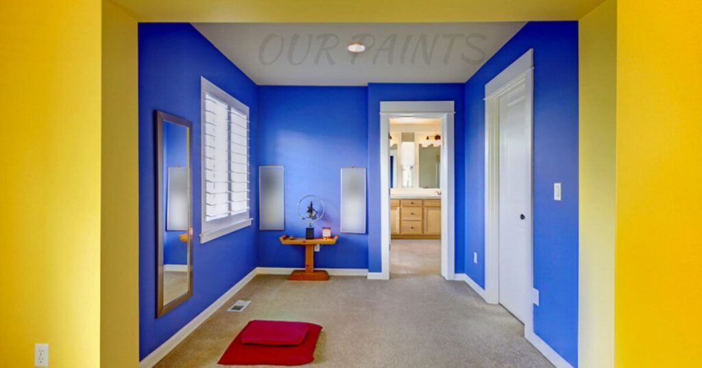
Boldness In Contrasting Hues:
Contrasting hues, boldly paired together, add a dynamic and vivacious flair to spaces. This trend is about juxtaposing colors that reside at opposite ends of the spectrum, creating visual tension that ignites energy and captivates attention.
It’s an audacious expression that celebrates the beauty found in stark contrasts, yielding spaces brimming with personality and vibrancy.
Subtle Sophistication Of Analogous Colours:
Analogous color palettes embrace subtle sophistication. These harmonious blends of neighboring hues on the color wheel offer a sense of cohesion and tranquillity.
Delving into this trend unravels the art of creating serene and balanced spaces, where colors seamlessly transition, evoking a sense of calmness and unity.
The Inspirational Power Of Trending Palettes:
Highlighting these trending color palettes isn’t just about showcasing the latest fads; it’s about igniting creativity and inspiration.
These palettes serve as a muse, sparking innovative ideas and inviting individuals to experiment with colors, encouraging them to infuse their spaces with trending hues that resonate with their sensibilities.
Personal Interpretation Of Trends:
Trends in color combinations offer a foundation for exploration, inviting personal interpretation and customization.
They act as a springboard for individuals to infuse their unique style and preferences, allowing them to adapt trending palettes to suit their personalities and the ambiance they envision for their spaces.
Empowering Design Evolution Through Trends:
Exploring these trends isn’t merely a journey through colors; it’s a glimpse into the evolution of design. It’s about embracing the fusion of tradition and innovation, empowering individuals to transform spaces by integrating trending color combinations into their design repertoire.
Room-Specific Colour Combinations:
Rooms are unique sanctuaries, each demanding a distinct ambiance that resonates with its purpose. Understanding ideal color combinations for various spaces isn’t just about paint; it’s about curating environments that nurture emotions and activities within those spaces.
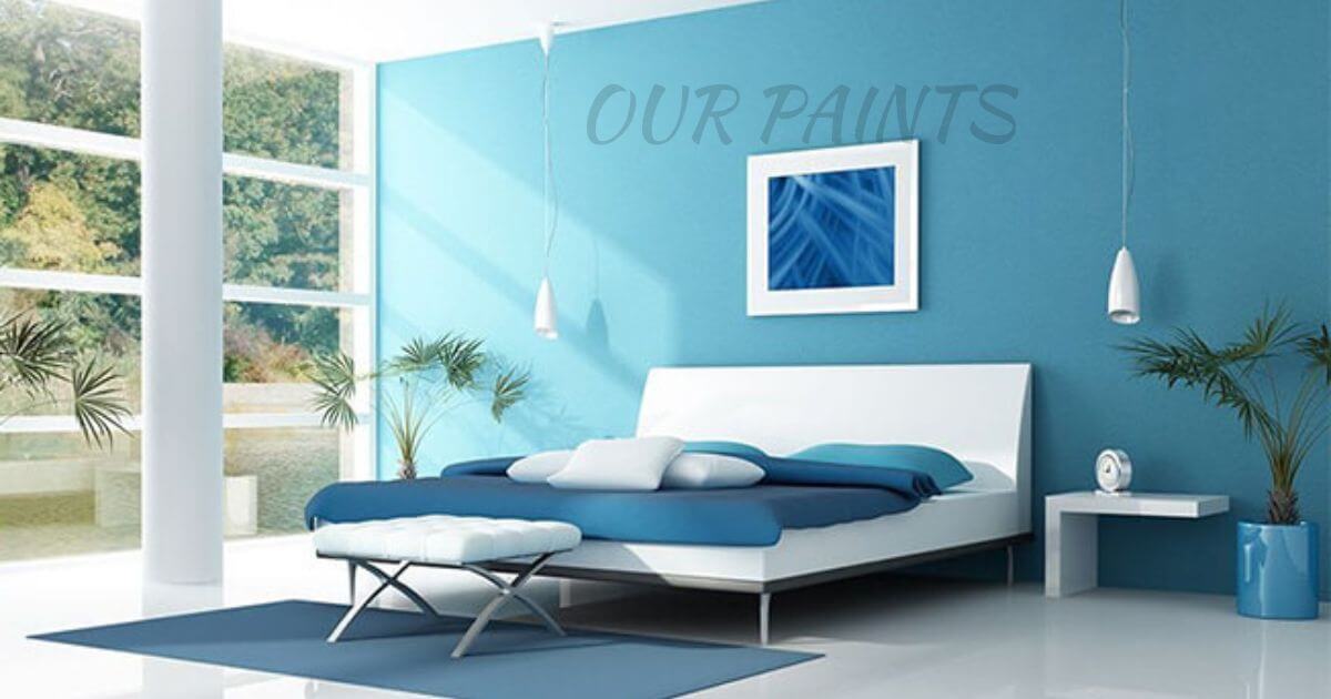
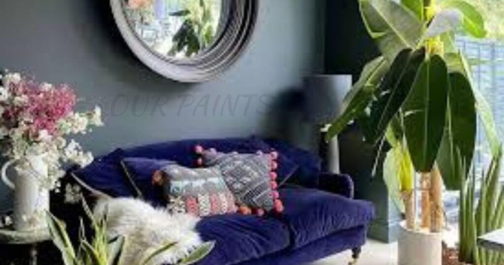
Calming Pastels For Serene Bedrooms:
Bedrooms serve as havens for rest and rejuvenation. Optimal color combinations here often involve soothing pastels—soft blues, gentle greens, or muted lavenders.
These hues create a tranquil atmosphere, promoting relaxation and fostering a serene ambiance conducive to peaceful sleep and unwinding after long days.
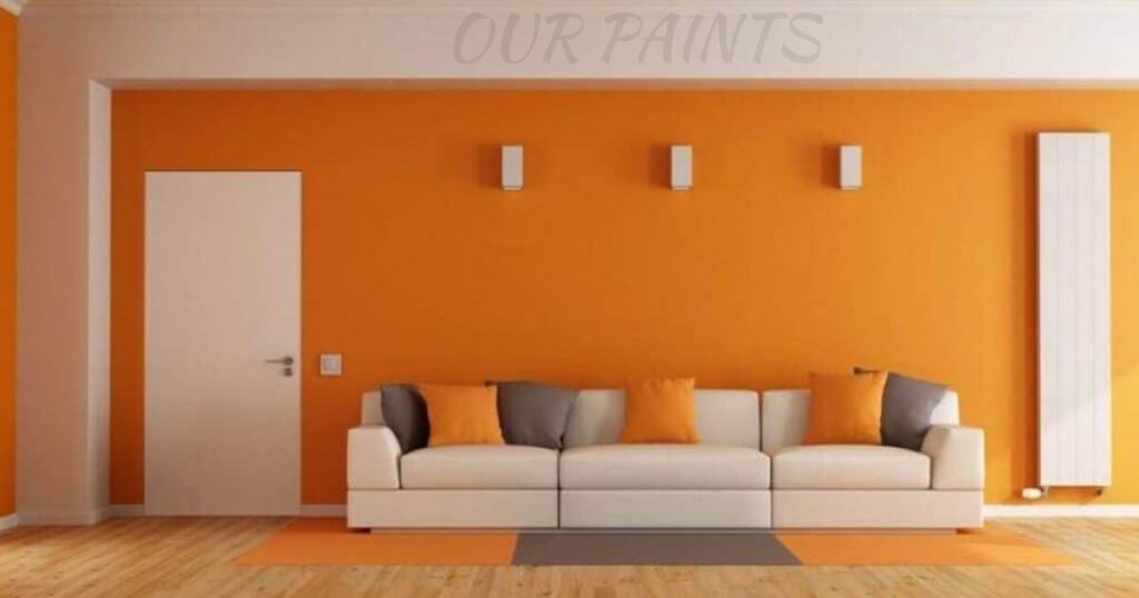
Energizing Tones For Productive Offices:
Offices thrive on productivity and focus. Energizing color combinations, like invigorating yellows, vibrant oranges, or refreshing greens, stimulate mental alertness and creativity.
These hues inject vitality into the workspace, inspiring motivation and fostering a conducive environment for efficiency.
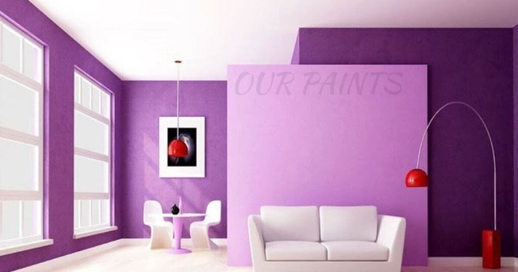
Inviting Hues For Welcoming Living Areas:
Living areas serve as the heart of a home—a space for gatherings and relaxation. Ideal color combinations here often feature warm and inviting tones.
Rich earthy browns, cozy reds, or welcoming neutrals create a sense of comfort and conviviality, inviting conversations and fostering a cozy ambiance.
Tailoring Choices For Specific Environments:
Understanding room-specific color combinations allows for tailored choices that cater to the unique needs of each space. It’s about aligning colors with the intended activities and emotions associated with those rooms, ensuring a harmonious blend between functionality and aesthetics.
Colors wield a profound influence on room dynamics. They have the power to alter perceptions of space, light, and mood. Strategic use of color combinations can manipulate these dynamics, transforming rooms into inviting, functional, and visually appealing spaces.
Harmonizing Color Choices With Functionality:
Beyond aesthetics, the selection of room-specific color combinations aligns with functionality. It’s about choosing colors that complement furniture, lighting, and decor, creating a cohesive and visually pleasing ensemble that enhances the overall ambiance.
Personalization For Emotional Resonance:
Understanding room-specific color combinations empowers individuals to personalize their spaces. It allows for the infusion of personal tastes and preferences, ensuring that the chosen Hughes resonates emotionally and reflects the inhabitants’ personalities within their living spaces.
Texture And Finish Interplay:
The interplay of texture and finish is a fascinating realm that significantly shapes color perception. Whether it’s the subtle elegance of matte, the reflective allure of glossy, or the tactile richness of textured finishes, each has a unique influence on how colors interact with light, thereby sculpting the ambiance of a space.
Matte: Subtle Sophistication:
Matte finishes exude a refined subtlety. They absorb light rather than reflect it, resulting in a velvety, non-reflective surface. Matte surfaces soften colors, providing a gentle and sophisticated ambiance, perfect for spaces seeking a serene and understated elegance.
Glossy: Reflective Brilliance:
In contrast, glossy finishes boast a reflective brilliance. They bounce light off their surfaces, intensifying colors and creating a striking visual impact.
Glossy surfaces add depth and vibrancy, infusing spaces with a lively and polished aesthetic, ideal for areas craving a touch of glamour and modernity.
Textured Finishes: Tactile Depth:
Textured finishes introduce a tactile dimension to surfaces. They play with light and shadow, adding depth and character to colors. These finishes create a dynamic interplay, evoking a sense of depth and intrigue within a space, and contributing to a rich and inviting ambiance.
The Art Of Texture Combination:
Combining different textures within a space is akin to painting with varied brush strokes. It allows for the creation of a multi-dimensional effect that elevates the visual appeal. Pairing matte walls with glossy accents or textured surfaces can add layers of interest, creating a captivating and diverse visual experience.
Manipulating Ambiance Through Texture And Light:
Understanding how textures and finishes interact with light empowers individuals to manipulate the ambiance of a room.
The choice of finish can alter the perceived size, brightness, and mood of a space, offering a spectrum of possibilities for crafting atmospheres that align with desired emotions and activities.
Seamless Integration For Visual Harmony:
Integrating diverse textures requires a delicate balance. Harmonizing different finishes ensures a cohesive and visually pleasing ensemble. It’s about creating a synergy where each texture contributes to the overall aesthetic, enhancing the space’s character and allure.
Expressive Potential In Texture Play:
Texture and finish selection isn’t solely about aesthetics; it’s about self-expression. It offers a canvas for personal style, allowing individuals to infuse their spaces with textures that resonate with their preferences and bring their vision to life.
Customization and Personalization:
Highlighting the essence of personal style and individual preferences is crucial in interior design. It’s about embracing uniqueness and guiding individuals on how to weave their personality seamlessly into color combinations, transforming spaces into reflections of their own essence.
Infusing Personality Into Colour Choices:
Guiding readers in infusing their personality into color combinations involves a delightful journey of self-expression. Techniques such as accent walls, carefully curated artwork, or thoughtfully chosen decorative elements serve as the artistic tools to bring one’s character to life within a space.
Accent Walls: Expressive Focal Points:
Accent walls stand as vibrant canvases for self-expression. They allow individuals to introduce a pop of color or texture that resonates with their tastes, instantly adding depth and personality to a room without overwhelming the space.
Artwork: Capturing Individual Tastes:
Artwork plays a pivotal role in reflecting personal tastes and interests. Whether it’s bold, abstract pieces or serene landscapes, artwork adds layers of meaning to spaces, serving as a visual storytelling element that speaks volumes about one’s personality.
Decorative Elements: Personal Touches:
Thoughtfully chosen decorative elements—be it unique furniture pieces, distinctive textiles, or intricate ornaments—act as personalized accents. They infuse spaces with charm and character, reflecting the nuances of an individual’s style.
Guiding The Journey Of Expression:
Guiding individuals on this journey of customization is akin to helping them articulate their visual language. It’s about providing the tools and inspiration needed to create spaces that resonate deeply with their identities and evoke emotions through tailored color choices and expressive elements.
Practical Application And Execution Tips:
Commencing with sample testing is a fundamental step in ensuring the precision of chosen colors. Painting small areas or using sample boards allows individuals to visualize how colors interact with their space’s lighting and existing decor. This hands-on approach aids in making informed decisions before committing to larger areas.
Considerations For Lighting Dynamics:
Understanding lighting dynamics is crucial. Natural and artificial lighting greatly influence how colors appear in a room. Take note of the intensity, direction, and color temperature of light sources.
Cooler tones thrive in natural light, while warmer hues complement artificial lighting. Adapting color combinations to lighting variations ensures consistency and desired effects.
Mastering Painting Techniques:
Mastering painting techniques is pivotal. Proper preparation of surfaces, choosing the right brushes or rollers, and employing even strokes contribute to flawless finishes. Techniques like cutting in edges and using painter’s tape ensure clean lines and professional outcomes, elevating the overall aesthetic impact.
Choosing The Right Finishes For Effectiveness:
Selecting the right finishes is equally important. Different spaces demand varied finishes; consider washable paints for high-traffic areas and matte finishes for spaces seeking a subdued elegance. Understanding the attributes of each finish aids in choosing ones that align with the room’s function and aesthetic goals.
Harmonizing Color Transitions:
Ensuring smooth transitions between colors is key. Blending or layering colors strategically, especially in open floor plans, maintains visual flow and coherence. It’s about creating a harmonious transition that complements rather than disrupts the overall ambiance.
Final Touches For Polished Results:
Paying attention to the final touches completes the transformation. Reevaluating color choices, assessing the overall impact, and making any necessary adjustments ensure a polished outcome that aligns with the envisioned color combinations and the desired emotional resonance within the space.
Offering actionable advice on execution and application empowers individuals to confidently bring their envisioned color combinations to life, transforming spaces into visually captivating and emotionally resonant environments.
Conclusion:
In the realm of Wall Paints Color Combination, the journey is an exploration of emotions, aesthetics, and personal expression. It’s a canvas where psychology meets design, where the interplay of hues creates spaces that resonate deeply with individuals’ moods, personalities, and activities.
Mastering color theory, understanding the impact of texture and finish, and embracing personalization within spaces elevate the art of selecting wall paint color combinations.
With practical execution tips in hand, individuals can confidently navigate the world of colors, transforming mere walls into dynamic expressions of style, functionality, and emotional connection within their living spaces.
Faqs About Wall Paints Color Combination:
Why are wall paint color combinations important for a room?
Wall paint color combinations set the tone and ambiance of a room. They influence emotions, impact perceptions of space, and complement furnishings. The right combination can transform a space into a cohesive, visually appealing environment.
How do I choose the right color combinations for my walls?
Consider the room’s purpose and desired mood. Utilise color theory principles like complementary, analogous, or monochromatic schemes. Test samples on the walls to see how they interact with light and existing decor before making a final choice.
Can I mix different finishes or textures within a room’s color combinations?
Absolutely! Mixing finishes or textures adds depth and visual interest. Combining matte with gloss or textured finishes creates a multi-dimensional effect, enhancing the room’s character and aesthetic appeal.
Are there specific color combinations ideal for certain rooms?
Yes, different rooms benefit from specific color combinations. Calming pastels work well in bedrooms, energizing tones in offices, and inviting hues in living areas. Tailoring colors to the room’s function and atmosphere is key.
How do I avoid overwhelming a space with bold color combinations?
Balance is crucial. Introduce bold colors in controlled ways, such as through accent walls or strategic accessories. Pair bold shades with neutrals or softer tones to maintain harmony without overwhelming the space.
What role does lighting play in wall paint color combinations?
Lighting significantly affects how colors appear. Natural and artificial lighting alters color perception. Consider the intensity, direction, and color temperature of light sources when selecting colors to ensure the desired effect.
Can personalization be incorporated into wall paint color combinations?
Absolutely! Personalization is key in design. Infuse your personality by incorporating accent walls, artwork, or decorative elements that resonate with your style and preferences, adding a unique touch to the color scheme.
1 thought on “Wall Paints Color Combination”