
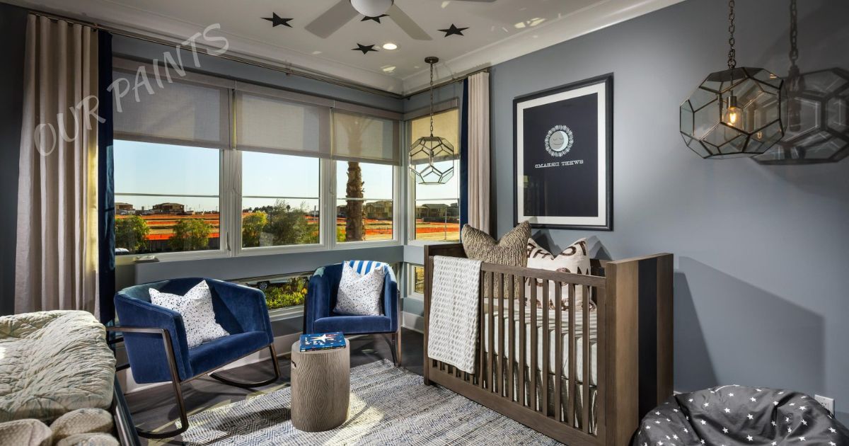
Creating a calming paint scheme for nursery is an artful endeavor that transcends mere decoration; it’s about sculpting an environment that fosters tranquillity and nurtures emotional well-being.
Soft pastel hues, like gentle blues, muted greens, and serene lavenders, play a pivotal role in establishing a serene ambiance conducive to a baby’s restful sleep and cognitive development.
This carefully selected palette isn’t just about aesthetics; it intertwines with color psychology, impacting emotions and behavior. By embracing a gradient approach, drawing inspiration from nature, integrating textures, and ensuring versatility, a calming nursery emerges as a sanctuary where both child and caregiver find solace and peace.
The Psychology Of Serenity In Color Selection:
Color psychology is an intricate study that delves deep into the emotional and psychological impact of colors on human behavior and perception. When selecting colors for a calming paint scheme, it’s crucial to comprehend the psychological nuances associated with different hues.
Soft pastels, such as soothing blues, gentle greens, and serene lavenders, are renowned for their ability to evoke feelings of tranquillity and calmness. These colors have a profound impact on the mind and body, influencing emotions, energy levels, and even physiological responses.
Soft blues, reminiscent of a clear sky or calm ocean, have been linked to lowering heart rates and reducing stress levels. Muted greens, resembling nature’s serene landscapes, promote a sense of harmony and balance. Delicate lavenders, associated with relaxation and peace, can create a tranquil atmosphere conducive to restful sleep.
The Influence of Environment on Well-being
The choice of colors in a nursery goes beyond mere aesthetics; it significantly affects the emotional and mental well-being of both infants and adults. For newborns and young children, the environment plays a pivotal role in their emotional development and overall temperament.
A calming paint scheme, with its carefully selected colors, contributes to a nurturing atmosphere that aids in soothing and comforting the child. Moreover, for parents and caregivers spending considerable time in the nursery, the ambiance directly impacts their stress levels and emotional state.
A serene color palette can create a sense of calmness, fostering a peaceful environment for bonding with the child and facilitating relaxation amid the demands of parenting.
Establishing Emotional Connections Through Color
Each color evokes specific emotions and associations. Soft pastels not only create a visually pleasing ambiance but also establish emotional connections within the nursery. Blues, with its associations with tranquillity, instill a sense of calmness and security.
Greens, reminiscent of nature, evoke feelings of growth and serenity. Lavenders, with their calming effect, create a soothing and restful environment. Understanding these emotional connections aids in creating a holistic and purposeful environment within the nursery.
It’s not merely about painting walls; it’s about orchestrating an emotional symphony that resonates with both the child and the caregivers, fostering a space that nurtures emotional well-being and facilitates a sense of tranquillity and peace.
Harmony In Hue Gradation:
Harmony in hue gradation is an artful technique in interior design that involves seamlessly blending colors to evoke a sense of balance and tranquillity within a space, particularly in a nursery setting.
This meticulous approach to color selection and placement involves a careful understanding of how different hues interact and influence the overall ambiance of the room.
The Art of Visual Flow
Incorporating a gradient approach in the nursery involves orchestrating a visual flow that guides the eye across the space. Lighter tones dominate the walls to establish a sense of airiness and spaciousness.
While slightly deeper or accent colors are strategically placed to highlight specific areas. This intentional arrangement creates a cohesive and visually appealing atmosphere, contributing to a sense of harmony and balance.
By utilizing lighter shades as the primary backdrop, the nursery can feel more expansive and welcoming. The gradual transition to slightly darker tones in specific zones or through accent pieces provides depth without overwhelming the space, maintaining a serene and calming environment conducive to relaxation.
Psychological Impact of Gradated Hues
The gradation of hues in a nursery holds significant psychological implications. A seamless transition from lighter to slightly deeper tones promotes a sense of serenity and aids in reducing visual clutter, thereby minimizing potential distractions.
This cohesive color scheme encourages a calm and focused mindset, essential for both infants and caregivers spending time in the nursery. Moreover, the subtle shifts in color tones can also affect the perception of space and depth.
Lighter hues tend to expand the visual perception of the room, making it feel more open and airy, while deeper tones or accents can create a sense of coziness and intimacy in specific areas. This interplay of colors contributes to a harmonious environment that accommodates both relaxation and stimulation as needed.
Nature-Inspired Palette A Breath Of Fresh Air:

A nature-inspired palette for a nursery encapsulates the essence of the outdoors, bringing elements of serenity, freshness, and harmony into the room.
Drawing inspiration from the natural world—lush green landscapes, calming blues of the sky, and the gentle warmth of sunlight—a nature-inspired color scheme evokes a sense of connection with the environment, fostering a serene ambiance within the nursery.
Channeling the Calm of the Outdoors
Integrating shades of soft greens reminiscent of verdant meadows and foliage infuses the nursery with a sense of natural tranquillity. Green, a color associated with growth and renewal, creates a nurturing environment that promotes a feeling of calmness and harmony.
These hues establish a refreshing backdrop that resonates with the tranquillity found in nature, encouraging a peaceful atmosphere for both the child and caregivers.
Complementing the greens with soothing blues reminiscent of clear skies or tranquil waters amplifies the sense of expansiveness and serenity within the room. Blues evoke feelings of calm and relaxation, mimicking the peacefulness of nature’s vast horizons.
This combination of greens and blues mirrors the soothing essence of the outdoors, creating a space that feels open, refreshing, and inherently calming.
The Warmth of Sunlit Hues
Incorporating gentle yellows or subtle touches of warm, sunlit tones into the palette adds a layer of comfort and positivity to the nursery. Yellow hues, reminiscent of sunlight, exude warmth and cheerfulness, creating a welcoming and uplifting atmosphere.
These hues can be strategically introduced through accessories, accents, or subtle paint details, adding a touch of brightness to the overall calming ambiance while maintaining the natural-inspired theme.
A nature-inspired palette not only enhances the aesthetic appeal of the nursery but also establishes a connection with the soothing elements of the environment.
It serves as a gentle reminder of the tranquillity found in nature’s embrace, fostering a serene and harmonious space that supports the child’s growth, development, and well-being.
This natural infusion of colors brings a breath of fresh air into the nursery, enveloping the room in a sense of calmness and serenity that echoes the beauty of the outdoors.
Texture And Tone A Multi-Sensory Experience:
Texture and tone in a nursery are not just about colors on walls; they encompass a multi-dimensional experience that engages the senses, fosters comfort, and contributes significantly to the overall ambiance of the room.
Intentionally incorporating various textures and tones amplifies the sensory richness of the space, creating a nurturing environment that goes beyond visual aesthetics.
Tactile Comfort: Enhancing Sensory Experience
Incorporating soft, tactile elements such as plush rugs, velvety fabrics, and textured wall coverings elevates the sensory experience within the nursery. These textures provide a comforting touch and encourage sensory exploration for the child.
Plush rugs or carpets offer a cozy surface for playtime and crawling, while textured wall coverings or decals add depth and visual interest, inviting tactile exploration.
Moreover, the inclusion of different textures within the nursery contributes to a diverse sensory environment, stimulating the child’s tactile senses and aiding in their cognitive and motor skill development.
The interaction with varied textures encourages sensory exploration, fostering a richer developmental experience.
Balancing Tone for a Harmonious Environment
While textures engage the tactile senses, the harmonious interplay of tones creates a cohesive and balanced atmosphere within the nursery. Combining different tones and shades, such as soft pastels or nature-inspired colors, ensures a visual harmony that complements the tactile elements.
Lighter tones on walls provide a serene backdrop, allowing textured elements and accent pieces to stand out without overwhelming the space. Strategically balancing tones prevent visual clutter and maintain a calming ambiance, essential for a nursery environment.
The integration of tones extends beyond walls and fabrics; it encompasses furniture, accessories, and decor, creating a unified visual experience that contributes to the overall tranquillity of the room.
Versatility and Longevity Growing with the Child:

The concept of versatility and longevity in a nursery transcends mere aesthetics; it encapsulates a thoughtful approach to creating a space that adapts and evolves alongside the child’s growth and development.
Designing with versatility in mind ensures that the nursery remains functional, relevant, and comforting through various stages of a child’s life.
Timeless Foundations: Colors and Basics
Opting for a timeless color palette forms the cornerstone of a versatile nursery. Neutral tones or soft pastels serve as a versatile canvas that seamlessly transitions across different developmental stages.
These timeless colors provide a soothing backdrop while accommodating evolving preferences. Moreover, investing in foundational elements such as convertible furniture, adaptable storage solutions, and durable materials ensures longevity.
A crib that converts into a toddler bed, adjustable shelving units, and versatile seating options offer flexibility, catering to changing needs as the child grows.
Adaptable Elements: Embracing Change
Integrating adaptable elements within the nursery design allows for easy updates and modifications. Incorporating removable wall decals, interchangeable accessories, and modular furniture facilitates effortless transitions from an infant-friendly space to an environment suitable for toddlers and beyond.
Fostering a sense of personalization and involvement enables the child to participate in the evolution of their space. Allowing them to choose decor elements or rearrange certain aspects instills a sense of ownership, empowering them to feel connected and comfortable within their environment.
Growing Together: A Haven of Continuity
A nursery designed for versatility and longevity serves as a haven of continuity amid the child’s developmental milestones. As the child progresses from infancy to early childhood, the adaptable space maintains its familiarity, providing a sense of security and comfort during transitions.
A versatile nursery not only supports the child’s growth but also alleviates the need for frequent redesigns or renovations.
This thoughtful approach to design not only benefits the child but also simplifies the process for caregivers, ensuring that the nursery remains a serene and nurturing space throughout the various stages of the child’s development.
Conclusion:
Crafting a calming paint scheme for a nursery involves more than just selecting colors; it’s about orchestrating an atmosphere that nurtures tranquillity. Soft pastels like soothing blues, gentle greens, and serene lavenders evoke feelings of calmness and rest.
These hues not only create a soothing backdrop but also contribute to a peaceful environment conducive to a baby’s restful sleep and overall well-being.
Incorporating these colors in a gradient approach or drawing inspiration from nature establishes a connection with serenity, while also considering textures and adaptable elements to ensure the nursery grows seamlessly with the child.
Ultimately, the art of designing a calming paint scheme extends beyond aesthetics; it’s a thoughtful curation that cultivates an environment fostering comfort, relaxation, and growth.
Through mindful color choices, adaptable elements, and a commitment to creating a nurturing space, a calming nursery not only soothes infants but also provides a serene haven that evolves harmoniously with the child’s development, supporting a journey of tranquillity and well-being.
Faqs About Calming Paint Scheme For Nursery:
Why is a calming paint scheme important for a nursery?
A calming paint scheme is crucial for a nursery as it sets the tone for a soothing environment, promoting a sense of tranquillity essential for a baby’s well-being. Calm colors contribute to better sleep, reduced stress, and a comforting atmosphere, creating an optimal space for both infants and caregivers.
Which colors are best for a calming nursery paint scheme?
Soft pastels such as gentle blues, muted greens, and serene lavenders are ideal for a calming nursery. These colors have been linked to feelings of relaxation and peace, creating a visually appealing and emotionally comforting space.
Can I use a gradient approach in a nursery’s paint scheme?
Absolutely! A gradient approach, transitioning from lighter to slightly deeper tones, can create visual flow and depth in the nursery. Lighter tones contribute to an airy feel, while subtle shifts in color provide a harmonious and calming ambiance.
How does a nature-inspired palette contribute to a calming nursery?
A nature-inspired palette, featuring soft greens, blues, and warm yellows, brings the calming influence of the outdoors into the nursery. These colors connect with nature’s serenity, fostering a sense of harmony and tranquillity that benefits both the child and caregivers.
Why is texture important in a nursery’s calming paint scheme?
Texture adds a multi-sensory dimension to the nursery, engaging touch and enhancing the overall experience. Soft rugs, plush fabrics, and textured wall coverings contribute to a tactile-rich environment, promoting comfort and sensory exploration.
How can a nursery paint scheme be versatile for the child’s growth?
Choosing timeless colors and adaptable elements like convertible furniture ensures the nursery remains relevant through various developmental stages. This versatility allows the space to evolve seamlessly as the child grows.
Are there benefits to a calming paint scheme beyond aesthetics?
Absolutely. A calming paint scheme goes beyond aesthetics, positively influencing emotional development, sleep patterns, and overall well-being for both the child and caregivers. It creates a serene haven that supports a nurturing environment for growth and relaxation.